Colormunki/ArgyllCMS profile lacking dark tones (compared to ccStudio)

Ink stained Fingers

Printer VIP
Platinum Printer Member
Joined
Dec 27, 2014
Messages
6,156
Reaction score
7,345
Points
373
Location
Germany
Printer Model
L805, WF2010, ET8550, T3100X
Please have a look to the last posting listed above

https://community.adobe.com/t5/ligh...print-module/m-p/14315976?profile.language=de

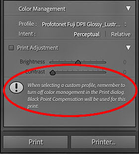
which shows a crop of a lightroom print control program window
BPC.jpg


This window shows an info text inside a program box "Black Point Compensation will be used for this print" for the activated perceptual RI , and as the explanation above goes, this BPC cannot be turned off for this rendering intent elsewhere in the program.
So this is intentional by Adobe and not a program fault, Adobe is limiting here the functionality of Lightroom vs. Photoshop which allows the deactivation of BPC for the perceptual RI.
 
Last edited:

Ink stained Fingers

Printer VIP
Platinum Printer Member
Joined
Dec 27, 2014
Messages
6,156
Reaction score
7,345
Points
373
Location
Germany
Printer Model
L805, WF2010, ET8550, T3100X
I read that for photography, which I profile for, only Perceptual and Relative Colorimetric are useful. Also, from what I read and understand for the Perceptual rendering intent it doesn’t matter if BPC is activated or not. That leaves me with these three combinations:

- Perceptual
- Relative Colorimetric without BPC
- Relative Colorimetric with BPC

I really hope that not all of them are combinations that should not be used. No matter wich combination I tried I get the same result:

Colormunki/ArgyllCMS profile: overall look of printout lacks contrast because of too bright black tones
Colormunki/ccStudio profile: prints look much better (yet less accurate colors because of 50+50 patch target sheet)
@lmylm ,

I think your questions are more than answered at this point - it's overall a complex relationship between the profiles, the rendering intent and the print program you are using like Lightroom or Qimage or else and the origin of your profiles like ArgyllCMS or ccStudio or Colormunki or Dataco....... - it comes effectively down to create a usability matrix which combinations work and which don't
 
Last edited:

Graeme Gill

Getting Fingers Dirty
Joined
Nov 13, 2014
Messages
32
Reaction score
34
Points
48
Location
Melbourne Australia
Printer Model
Epson R1800
There is a problem for quite a number of users of the popular Lightroom package - BPC is always on in Lightroom for the perceptual rendering intent , you find quite some postings to this problem in luminous-landscape.com or dpreview.com and at plenty other postings like here
Then I suggest that a customer of Adobe (i.e. someone who owns a copy of Lightroom) report the problem to them
- I can't, since I'm not a customer!

Or use some other software without this bug, instead of Lightroom to manage your printing color workflow.
ArgyllCMS profiles match ICC specifications and work as intended with any software that doesn't impose a mandatory broken non-ICC BPC on the workflow. You can use ArgyllCMS's tools to process the color of images for printing if you want to convince yourself that the profiles work as intended.

Note that Adobe's own documentation on their BPC states that it is not normally used with Perceptual rendering intent. They state "Therefore, BPC should not be necessary." "For a given picture, the user can decide whether using BPC improves the color conversion and can select it or deselect it accordingly."
So it appears that Lightroom is not following their own guidance on this topic.
 

Ink stained Fingers

Printer VIP
Platinum Printer Member
Joined
Dec 27, 2014
Messages
6,156
Reaction score
7,345
Points
373
Location
Germany
Printer Model
L805, WF2010, ET8550, T3100X
Oh well - Adobe is creating a kind of their own color mgmt environment with this and that modification which they don't clearly communicate to Lightroom users - and even more to potential buyers of Lightroom.

But this is not the only company which thinks they can do it better.
When it comes to Datacol.. profiles they even recommend the preferable use of the saturation intent , this leaves Lightrooom users completely out of the softproof function - LR does not offer this RI at all. And just using another RI makes the softproof function pretty useless .

'Rendering Intent“ select the appropriate
settings. Besides “Saturation“ – which we recommend for the
use with profiles created by our SpyderPRINT-solution –

“Perceptual” and “Relative Colorimetric” may also be used'

copied from here
https://www.datacolor.com/spyder/downloads/Print-with-ICC-in-PS.pdf
on page 2.
And turn off BPC - which you can't with the preceptual RI and a Datacol.... profile in LR.

Or is this supposed to mean that the rendering intent does not matter at all ?

A journey to uncover all this was done some time ago

https://www.printerknowledge.com/th...r-print-profile-comparisons.13275/post-122562

Would you ever expect that much surprise and fun with icc-profiles ?????????????????
 
Last edited:

Derlan

Print Lurker
Joined
Feb 22, 2025
Messages
1
Reaction score
0
Points
1
Printer Model
Canon PIXMA PRO-200, L805
Hi 👋 can I put in my 2 cents too?
Basically I have the same problem - I have colormunki, I have a printer, but I can't get pure black.

Even initially the Epson L805 printed not badly, but I decided to try to profile it using the article by Anders Torger and now everything is almost perfect, but then I got bored and decided to buy a Canon Pro 200 (because it was being sold for 20% of its cost and it printed A3) and that's where my hell began.

Yes, I use non-original InkMate inks for the Pro100 printer model (because their print heads are the same and the colors are the same. I asked other companies including Revcol, InkTec and others and they all say that Pro100 inks are suitable for Pro200), but the problem is in the dark color - if Epson prints almost pure black on the same paper, then Canon adds blue color in dark tones and I don't know what to do with it.

With my human eye on test patches I see black, but colormunki and even a regular scanner for some reason see red shades where I see black-blue tones - what's happening ?!
doc100123620250222105512_001.jpg
doc300123820250222105627_001.jpg
Epson L805 scanCanon Pro200 scan

Photoshop_R2UeuODqCo.jpg
Camera shot

My guess is that the ColorMunki/scanner is acting "weird" with Canon inks directly because even after making a test palette of 3000+ patches I still didn't get anything good with black tones
gamutvision_pHliipXDD2.png
gamutvision_aL4PQdoebt.png
gamutvision_kWDi65WKBO.png
gamutvision_IhgS1LwObb.png
Epson L805
Brauberg 180
Argyll CMS 1680 patches
Canon Pro200
Brauberg 180
ccStudio
Canon Pro200
Revcol 230
ccStudio
Canon Pro200
Brauberg 180
Argyll CMS 3360 patches

I can say that I can get good light shades, but even through ccStudio or ColorMunki Photo software everything starts to break down on dark tones
ccStudio_cuSd13b1e5.png
ccStudio_Hz8QEHwooI.png
 
Last edited:

Ink stained Fingers

Printer VIP
Platinum Printer Member
Joined
Dec 27, 2014
Messages
6,156
Reaction score
7,345
Points
373
Location
Germany
Printer Model
L805, WF2010, ET8550, T3100X
3000+ patches will not improve the black level, I have another assumption - it's the black ink itself. I assume that you are using a dye inkset on the L805 which makes a little bit difficult to compare it with the Pro100/200 pigment inks. I'm not a Canon user but tested and use a Canon black for various reasons, I got excellent results - gloss - black level - with inks drained from expired cartridges retrieving PFI-304 or PFI-703 photo black inks. I was running such inks on a 24" P7600 for a while. and as well on a WF-2010W for test purposes. I'm doing profiles with the i1Profiler package.
I'm currently getting off better with a PFI-050 black on a Epson SC-T3100X than with an Epson ink, the PFI-050 delivers a pretty good black both on normal, coated matte and glossy papers at the same time.
 

Epatcola

Getting Fingers Dirty
Joined
Mar 21, 2020
Messages
30
Reaction score
8
Points
23
Printer Model
various
With my human eye on test patches I see black, but colormunki and even a regular scanner for some reason see red shades where I see black-blue tones - what's happening ?!
Black dye inks tend to look reddish brown under low color temperature lighting, Can you view spectrum data from Argyll charts or spotread with plot a black patch? You will likely see L peak up significantly at the low end of the spectrum.

What light are you viewing your prints in when blacks look a bit blue? The profiles you generated are probably trying to compensate. Maybe the ink you are using is actually crappy. You could compare a patch from the Epson.
 

x64

Printing Apprentice
Joined
Feb 21, 2025
Messages
12
Reaction score
5
Points
13
Printer Model
Epson Stylus R2400 2100 & more
Black dye inks tend to look reddish brown under low color temperature lighting, Can you view spectrum data from Argyll charts or spotread with plot a black patch? You will likely see L peak up significantly at the low end of the spectrum.

What light are you viewing your prints in when blacks look a bit blue? The profiles you generated are probably trying to compensate. Maybe the ink you are using is actually crappy. You could compare a patch from the Epson.
Another simple way to view this effect is to illuminate with a incandescent light bulb, which typically have a wider colour spectrum compared to most common led lighting. Most black fabric reveals its true brownish dye under those bulbs too. The wavelength makes it visible, the colormunki and scanner can see it too, but reflecting led or daylight waves not so much.
It is why I ditched all the led in my home and upgraded back to the classic bulbs. In a well isolated home they double as a space heater too. Barely had my heater on this winter!
1740362426934.jpeg
 
Last edited:
Top