You are using an out of date browser. It may not display this or other websites correctly.
You should upgrade or use an alternative browser.
You should upgrade or use an alternative browser.
Using ArgyllCMS + Colormunki to produce excellent printer profiles
- Thread starter pharmacist
- Start date
nrdlnd
Fan of Printing
- Joined
- Jan 19, 2015
- Messages
- 74
- Reaction score
- 31
- Points
- 63
- Printer Model
- Epson Stylus Pro 3880
I don't know how to post them as text files. Please tell! What are you analyzing? I'm thankful for all help.
I think this thread has been a lot about how to squeeze as many patches as possible on an A4 (or Letter) paper) in an assumption that 'more is better'. To be able to do that it's necessary to make the chart for a bigger paper and then crop it. I have done that but I've found that for me and with the i1 Pro there are about 798 patches on A4 and 800 on Letter that's maximum useful in practice. The patches are then 7mm wide. These charts are possible to read with careful positioning without too many misreads. That's what works for me.
Although I visually can't see much difference between these charts and the first chart I made with 720 patches without crop and resize. A 1440 chart was a little better and a chart made in two steps with a "preprofile" was maybe even a little better with better gradations especially in the colors. But the differences are very small visually and I can't always separate them from each other.
So I decided to start it all over again with wider more easily read charts and without cropping and resize. I did it like this: First i made one chart with 576 patches e4 and g64. This profile can also be used for 'preprofiling' a bigger chart. I have also made a profile from the same chart size but with g128 and 1152 patches (on two A4). In printtarg I use -a1.0 -m0 -M0 -p297x210 (to get horizontal format). This makes 8 mm wide patches.
I then printed the charts with the Adobe Printing Utility. I did set horisontal format and 0 margins. In the Epson printer driver I set paper type and quality and no color profiling and preview of the print. In the second tab I set custom enlargement to 104%. In the preview I can see that all strips are printed. In this way I get a chart that's using almost the whole paper without having to do a separate resize and crop and get a chart thats easy to read. It's also nice to have the Argyll text with the chart properties.
But then what's the quality? Visually (what I think is most important!) I can't see much difference between any of the profiles that I've made. I have been using Relative Colorimetric and BPC on. I still have to make one more profile and that's the one in two steps with a preprofile that's imbedded in 'targen'. I've also found out that it's much easier to get good profiles from matte papers than glossy or semiglossy. Is it because of less D-max or because it's easier for the meter to read from a less reflecting surface?
Regards,
Per
- Joined
- Jan 4, 2012
- Messages
- 1,675
- Reaction score
- 1,309
- Points
- 277
- Location
- UK
- Printer Model
- Canon Pro9000 II
I don't know how to post them as text files. Please tell! What are you analyzing? I'm thankful for all help.
Copy your profile to some convenient folder, highlight the profile name, right click, choose rename and change -------.icm to -------.txt, you can then upload the text file into a Printer Knowledge posting. This will enable other members to use your profile and analyse it's contents. (You can ignore the warning about making the file unusable)
As Argyll carries a free use copyright, you can do this with Argyll profiles, but not with, for example, ColorMunki profiles.
There are many examples using this renaming to .txt in
http://www.printerknowledge.com/threads/a-basic-guide-see-post-1-to-setting-up-argyll-cms-profiling-on-your-computer.8570/
see post #195 on page 20, for example. But if you are tempted to try them out, rather than just analyse them, make sure you know for which ink, paper and printer they were made.
To use a profile simply rename back to .icm and place it in your ....spool/drivers/color folder.
Last edited:
RogerB
Print Addict
- Joined
- Sep 27, 2010
- Messages
- 293
- Reaction score
- 316
- Points
- 183
- Location
- S.E. England
- Printer Model
- Epson Pro3880
I think there is a danger in chasing the maximum number of patches on a sheet. You say that you can read a particular patch density "without too many misreads". If I have to re-scan a strip and the re-scan is accepted it suggests to me that the random errors are too large - that is, I am working at the very limit of the instrument's capability. Re-reading a strip because of a mis-read does not, statistically, improve the overall accuracy.I don't know how to post them as text files. Please tell! What are you analyzing? I'm thankful for all help.
I think this thread has been a lot about how to squeeze as many patches as possible on an A4 (or Letter) paper) in an assumption that 'more is better'. To be able to do that it's necessary to make the chart for a bigger paper and then crop it. I have done that but I've found that for me and with the i1 Pro there are about 798 patches on A4 and 800 on Letter that's maximum useful in practice. The patches are then 7mm wide. These charts are possible to read with careful positioning without too many misreads. That's what works for me.
Although I visually can't see much difference between these charts and the first chart I made with 720 patches without crop and resize. A 1440 chart was a little better and a chart made in two steps with a "preprofile" was maybe even a little better with better gradations especially in the colors. But the differences are very small visually and I can't always separate them from each other.
So I decided to start it all over again with wider more easily read charts and without cropping and resize. I did it like this: First i made one chart with 576 patches e4 and g64. This profile can also be used for 'preprofiling' a bigger chart. I have also made a profile from the same chart size but with g128 and 1152 patches (on two A4). In printtarg I use -a1.0 -m0 -M0 -p297x210 (to get horizontal format). This makes 8 mm wide patches.
I then printed the charts with the Adobe Printing Utility. I did set horisontal format and 0 margins. In the Epson printer driver I set paper type and quality and no color profiling and preview of the print. In the second tab I set custom enlargement to 104%. In the preview I can see that all strips are printed. In this way I get a chart that's using almost the whole paper without having to do a separate resize and crop and get a chart thats easy to read. It's also nice to have the Argyll text with the chart properties.
But then what's the quality? Visually (what I think is most important!) I can't see much difference between any of the profiles that I've made. I have been using Relative Colorimetric and BPC on. I still have to make one more profile and that's the one in two steps with a preprofile that's imbedded in 'targen'. I've also found out that it's much easier to get good profiles from matte papers than glossy or semiglossy. Is it because of less D-max or because it's easier for the meter to read from a less reflecting surface?
Regards,
Per
Nevertheless, I see that your experimenting has led you to virtually the same place that I reached with my i1Pro. The important thing for me is being able to print the charts, read them using the normal i1Pro ruler with no misreads and generate a good profile. I do this with 1058 patches on two A4 sheets - not very different from your 1152. An added advantage for me is that I can give the two TIFFs to anyone and they can print them (using ACPU) without any more corrections or adjustments; I can then use their printed charts to make a profile.
I'm not surprised that you don't see much difference in the profiles if you are comparing prints side by side, one in each hand. Argyll should always give you a profile that is accurate within 2-3 deltaE and with this kind of difference the prints will be virtually identical. For me, a good colorimetric profile has to be accurate and "smooth". Accuracy means that the printed colours match as closely as possible the colours in the image file. This can be measured by printing and measuring a test image, but of course this can only check a finite number of discrete colours. To check "smoothness", the way in which the printer handles colour gradients, you generally have to rely on visual assessment. For this job synthetic images like the Grainger rainbow or Bill Atkinson's "14 balls" are most revealing.
If we are talking about perceptual rendering then accuracy doesn't really come into it. Colours will be re-mapped in a way that the software developer thinks will give a pleasing image. On the other hand smoothness is very important so test prints are useful.
Before actually committing to test prints a couple of us on this forum use Gamutvision to evaluate our profiles. This is why Emulator suggested that you might like to post an example (or two) of your profiles so that we can look at them in Gamutvision. It's often possible to see problems in a profile very quickly using Gamutvision - even problems that don't always show up in a particular print.
I can't say that I have found it more difficult to get good profiles on glossy than on matte papers. If anything I find that my matte profiles, although perfectly adequate, are slightly less accurate than those for glossy papers. Do you have examples of how they are better?
nrdlnd
Fan of Printing
- Joined
- Jan 19, 2015
- Messages
- 74
- Reaction score
- 31
- Points
- 63
- Printer Model
- Epson Stylus Pro 3880
I can't say that I have found it more difficult to get good profiles on glossy than on matte papers. If anything I find that my matte profiles, although perfectly adequate, are slightly less accurate than those for glossy papers. Do you have examples of how they are better?
The example I can give is that when I made a profile from an experimental chart with 800 patches on Museo Portfolio Rag (a smooth matte paper) I got
Peak err = 1.151, avg err = 0.2692, RMS = 0.3111 and no misreads at all (7mm wide patches). When I made the same with a very similar chart and Canson Baryta Photographique I got many reading errors (I repeated the readings until they were OK) and a much worse 'err' and 'RMS' results. The resulting picture (a portrait I know well) is very good for a matte paper even if I prefer this picture printed on papers like Canson Baryta Photographique or even more on Canson Platine Fiber Rag. When I make profiles on more glossy papers usually the peak and avg err readings and the RMS readings are worse with a factor 2 but the resulting profiles are visually good. Can you explain this?
Before actually committing to test prints a couple of us on this forum use Gamutvision to evaluate our profiles. This is why Emulator suggested that you might like to post an example (or two) of your profiles so that we can look at them in Gamutvision. It's often possible to see problems in a profile very quickly using Gamutvision - even problems that don't always show up in a particular print.
I will choose a couple of profiles for you to evaluate. One of them will be the profile for Museo Portfolio Rag.
Per
nrdlnd
Fan of Printing
- Joined
- Jan 19, 2015
- Messages
- 74
- Reaction score
- 31
- Points
- 63
- Printer Model
- Epson Stylus Pro 3880
To check "smoothness", the way in which the printer handles colour gradients, you generally have to rely on visual assessment.
That is exactly what I've been trying to do
RogerB
Print Addict
- Joined
- Sep 27, 2010
- Messages
- 293
- Reaction score
- 316
- Points
- 183
- Location
- S.E. England
- Printer Model
- Epson Pro3880
If you had lots of reading errors, repeating the readings "until they were OK" did not improve the accuracy of your data. I can't say why you had lots of errors but it just indicates that the charts were not optimised for the measuring instrument. As for the reported errors in Argyll, you have to remember that a normal person cannot see any difference in colours if the "error" is 1.00. In fact, for more saturated colours it is difficult to detect an error of 3 or more. So, your Argyll profiles are giving "errors" that are generally not detected by a normal person.The example I can give is that when I made a profile from an experimental chart with 800 patches on Museo Portfolio Rag (a smooth matte paper) I got
Peak err = 1.151, avg err = 0.2692, RMS = 0.3111 and no misreads at all (7mm wide patches). When I made the same with a very similar chart and Canson Baryta Photographique I got many reading errors (I repeated the readings until they were OK) and a much worse 'err' and 'RMS' results. The resulting picture (a portrait I know well) is very good for a matte paper even if I prefer this picture printed on papers like Canson Baryta Photographique or even more on Canson Platine Fiber Rag. When I make profiles on more glossy papers usually the peak and avg err readings and the RMS readings are worse with a factor 2 but the resulting profiles are visually good. Can you explain this?
I will choose a couple of profiles for you to evaluate. One of them will be the profile for Museo Portfolio Rag.
Per
I don't know why your glossy profiles report larger errors - mine are normally better than those for matte papers. Maybe by looking at them in Gamutvision we will learn something?
nrdlnd
Fan of Printing
- Joined
- Jan 19, 2015
- Messages
- 74
- Reaction score
- 31
- Points
- 63
- Printer Model
- Epson Stylus Pro 3880
OK! Here I have two profiles that I think could be interesting. One is made on the Canson Baryta Photographique in two steps. First a preprofile with 576 patches on A4. This one is used in the second 1152 patches profile on two A4 papers.
The second profile I made on a matte paper Museo Portfolio Rag also in two steps. the preprofile with a chart with 800 patches and the second on two Letter size papers with 1440 patches. Printer settings: Premium Semigloss Photo Paper and Quality (5) for Canson Baryta and USFAP and Quality (5) for Museo Portfolio.
The err readings on these profiles were about the half on the matte Portfolio Rag paper. My experience with profies made in this way in two stages may have better gradations especially in the colors but the difference is small compared to a profile made without a preprofile.
Please analyze if you like!
Attachments
Last edited:
RogerB
Print Addict
- Joined
- Sep 27, 2010
- Messages
- 293
- Reaction score
- 316
- Points
- 183
- Location
- S.E. England
- Printer Model
- Epson Pro3880
What test prints have you have you used? If they are your own images, especially if they are portraits, they may not show up the differences.That is exactly what I've been trying to do! I have valued those test prints as subjectively 'better'.
The analysis is interesting, but with no real surprises. The colour gamut on the baryta paper is very wide, typical of a baryta with pigment ink. Colour gamut on the matte paper is again typical, i.e. much smaller than the gloss. Here's how Gamutvision shows the comparison with AdobeRGB. The Grainger rainbow at the top right is a simulation of how a print would look. In each case this shows smooth transitons between colours, with no holes or bands.OK! Here I have two profiles that I think could be interesting. One is made on the Canson Baryta Photographique in two steps. First a preprofile with 576 patches on A4. This one is used in the second 1152 patches profile on two A4 papers.
The second profile I made on a matte paper Museo Portfolio Rag also in two steps. the preprofile with a chart with 800 patches and the second on two Letter size papers with 1440 patches. Printer settings: Premium Semigloss Photo Paper and Quality (5) for Canson Baryta and USFAP and Quality (5) for Museo Portfolio.
The err readings on these profiles were about the half on the matte Portfolio Rag paper. My experience with profies made in this way in two stages may have better gradations especially in the colors but the difference is small compared to a profile made without a preprofile.
Please analyze if you like!
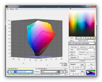
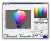
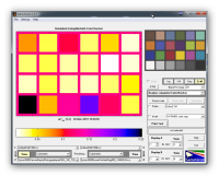
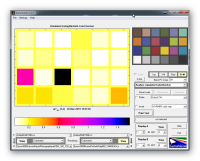
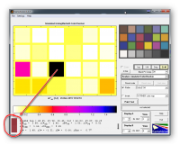
The analysis suggests that the accuracy for the colours in the ColorChecker24 is very slightly better for the baryta paper. However, the predicted errors are so small as to be undetectable by eye, except for one colour. The rendering of the red on the matte paper shows an error of 1.56 deltaE - just detectable when placed side-by-side with the desired colour. The comparison is shown in the third screenshot below. If you look carefully at the circled area you should see that the rectangle is split in two - the top half is the desired colour and the bottom is the (predicted) printed colour.
B&W response for each paper is very good with negligible colour cast. One very slight concern is that the baryta paper shows a reduction in contrast in the deep shadow region. I have observed slightly anomalous behaviour in this region as have others, but I do not think we know the cause. Whether this behaviour is significant in actual prints is open to question. We are really looking at subtle effects here and it is quite possible that we are stretching the capabilites of this type of analysis.
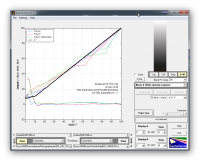
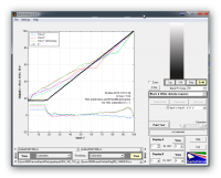
Can you say from this anlysis that one method gives a better profile than another? I don't think so. Both profiles look very good and I am sure would more than satisfy most photographers. Is there any point in trying to improve them? I doubt it.
I hope that is of some interest, if only to the fellow geeks on this forum.
Last edited:
nrdlnd
Fan of Printing
- Joined
- Jan 19, 2015
- Messages
- 74
- Reaction score
- 31
- Points
- 63
- Printer Model
- Epson Stylus Pro 3880
I have used a very common chart the one with portraits of children in the lowest row. The portrait I'm talking about is rather good as it has a great dynamic range.What test prints have you have you used? If they are your own images, especially if they are portraits, they may not show up the differences.
Roger thank you very much for your analyze! It seems as the variant with bigger patches is as good as the other with more patches. What I think could be interesting is to compare with a profile made with 1152 patches on two A4 papers. I have such a profile and I can download it. It could be interesting to see if the extra work with preprofiling is to any advantage?
