Problems with Pixma IX6850

floK

Fan of Printing
Joined
Apr 6, 2016
Messages
70
Reaction score
28
Points
68
Printer Model
Canon Pixma IX6850
LOGO_print_low res_.jpg
View attachment 4091 Hi to all!
Two weeks ago I bought a Pixma IX6850 to replace my dead (RIP!) HP OfficeJet Pro K850, that served me for 10 years without shining, but also without too much troubles.
As an architect, the first tests I've made with the new printer were that of the blueprints - and these were excellent, with a very good resolution of text and lines.
But, as I also have some works as a graphic designer, today I tested the printer on a logo that I've just made... and I am very disappointed!
As you can see in the attached jpeg, the pure yellow (0,0,100,0 CMYK) of the original document becomes a kind of orange when printed. This is the main problem with colors (let's say that the shift of the dark blue - 100,93,18,55 CMYK - to a sort of indefinite grey doesn't bother so much), but there is also a very visible banding in black!
I must say that I tried different print settings both in CorelDraw and Adobe Illustrator, but the results were, each time, the same.
So, do you think that I bought a defective printer and I should return it to the vendor? Or could you advice me about some settings/troubleshooting to try before?

P.S.
I omitted to say that I use the original "setup" cartridges that came with the printer.
And that the nozzle check gave perfect results, without any banding and with a normal yellow.
 
Last edited:

The Hat

Printer VIP
Platinum Printer Member
Joined
Jan 18, 2010
Messages
15,792
Reaction score
8,824
Points
453
Location
Residing in Wicklow Ireland
Printer Model
Canon/3D, CR-10, CR-10S, KP-3
@floK, For a start your attachment does not open, and yes your colours are all over the place, but from what I can tell for several reasons.

The banding you refer too maybe caused by cyan or magenta not firing continually, or the Apps. your using could be set for CYMK instead of RGB causing your colours to shift out of gamut, and lastly the printer is best suited for photo printing and not graphics.
 

MP640

Print Addict
Joined
Oct 20, 2010
Messages
196
Reaction score
71
Points
168
Location
The Netherlands
Printer Model
Canon MG6150
Maybe it would help to create custom icc profiles for the ink-paper combination that you are using?
 

floK

Fan of Printing
Joined
Apr 6, 2016
Messages
70
Reaction score
28
Points
68
Printer Model
Canon Pixma IX6850
@floK, For a start your attachment does not open
Do you mean that there isn't any visible image in my post? Strange, because I can see it very well, just before the text... Or are you referring to that "view attachment 4091"? That was the first try to upload the (same) image, but the site gave me the message that it was too large (indeed, it was about 10 MB) so that I canceled the action, resized the image, then uploaded again. I don't know why the false attachment remained there.
@floK
The banding you refer too maybe caused by cyan or magenta not firing continually, or the Apps. your using could be set for CYMK instead of RGB causing your colours to shift out of gamut, and lastly the printer is best suited for photo printing and not graphics.
Here there are three different ideas:
1. "cyan or magenta are not firing continuously" - if so, I should see this in the nozzle check tests, but these are perfect for C,M,Y and dye black, as well as for the grid of thin lines representing the pigment black. My conclusion from here is that the pigment black is intended only for thin lines and, when it is used on large surfaces, it cause bandings. Of course, this could be avoided by printing only on photo paper (when the black is formed using only the dyes), but... this is a big shit (sorry!) as the graphic works (as logos) should be presented on plain paper (because, in practise, they will be used mainly on plain paper)!
2. "the Apps. your using could be set for CMYK instead of RGB causing your colours to shift out of gamut" - of course, I know this and allways work in a CMYK space when the destination is for printing (opposed to the RGB space that I use when the destination is the screen). I also use the options of "proof colors" (in Adobe Illustrator and CorelDraw) and "gamut warning" (in Adobe Photoshop), so that usually I have no surprises. But the Canon inks seems to have an unusually narrow gamut for plain paper (ICC: Canon IJ Color Printer Profile 2005). Almost unusable!
3.3. "the printer is best suited for photo printing and not graphics" - if so, what is the difference between IX series and IP series?! The graphics capabilites - highlighted on the Canon website, but also praised in some independent (?) reviews - were the main reason for which I opted for an IX! If my interests were in professional photo printing, I would have chosen something else (probably an Epson).
But are all these marketing lies? Or Canon specialists (and those independent reviewers) don't know what means "business needs" and they imagine that the "high-quality documents" should be printed only on Canon photo paper, for good results?!
In this case, they should learn from HP! With my former Officejet I had never problems with the quality of the prints on plain paper (as banding or color shifting) and it also was able to print enough good photos (at least for presentation purposes).
Unfortunately, the current Officejet models do not have the same quality. And, yes, I considered that a better photo quality (as Canon provides) would be a bonus for an office printer, because it will permit me some photo-hobbyist joys, too :) But I didn't expected the "office" part to be inappropriate!

Maybe it would help to create custom icc profiles for the ink-paper combination that you are using?
Of course, I'll work to some custom ICC profiles for special (photo) papers, but I didn't expect to need this for plain paper! Until now, with other printers, I have used only the Adobe ICC profiles (e.g. Uncoated FOGRA29) with very good results. I never experienced such color shifts as with Canon!
 
Last edited:

The Hat

Printer VIP
Platinum Printer Member
Joined
Jan 18, 2010
Messages
15,792
Reaction score
8,824
Points
453
Location
Residing in Wicklow Ireland
Printer Model
Canon/3D, CR-10, CR-10S, KP-3
@floK, Graphic work is far more demanding on ink flow that photographic work is and is a specialised art in itself and can’t be learned it has to be taught.

Now I fully understand why you have the attachment 4091 still left in your post.

Starting with the nozzle check, it can only show that all of the nozzle are clear and working properly, it can't show when you have lower than average ink flow, and no the pigment black is not just for thin lines, but is only used in certain file types and on certain surfaces.

Now just because your using mainly plain paper does not mean your printer will use the pigment black, in fact if you look at the highlighted area in you uploaded image you’ll clearly see the yellow banding stripes, which indicates that the dye ink was used in your image and not pigment ink.

The CorelDraw and Illustrator Apps. are far more difficult to master that Photoshop can be and where most lose out is when they try to print because that’s where all their issues tend to surface.

You can use which ever colour mode you like but if your monitor is not calibrated then your output is going to be different, and that goes double for graphics because they have originated from the screen and not from a camera first.

The next problem you have is you don’t understand the printer, yes it uses CYMK ink but the on screen RGB images are converted by the print driver for output, there are no such things as RGB inks only images, so if you insist on working in CYMK then your colours will be outputted incorrectly every time, when trying to convert the converted it simply runs into gamut issues.

Epson and Canon do their marketing and advertising extremely well but they specifically only refering to their inks when used on their paper and not to any third party ink or paper, so no lies are applicable to any of the reviewers.

To print good quality graphics you need a printer that has far more than four colours and even then you may need to overprint the image twice depending on the paper surface used, so desktop printer just cant cut it for true high quality output.

ICC profile are very necessary for proper colour rendition especially for plain or matte surfaces, the use of digital paper is also recommend for good quality output and this is especially true to insure no loss when using corporate colours.

The more upmarket the printing equipment used is, the more technical experience the operator needs for good quality output, now here’s the sting in the tail, the Application itself determines which type of output it send to a printer and ninety times out of a hundred the printer will convert that file to a raster image for output, using only dye inks, ironically, the printer will bitmaps all text files too.

All printer are different and no two are the same so don’t expect every printer you buy to act the same as the previous one, they won’t regardless of brand name..
 

floK

Fan of Printing
Joined
Apr 6, 2016
Messages
70
Reaction score
28
Points
68
Printer Model
Canon Pixma IX6850
and no the pigment black is not just for thin lines, but is only used in certain file types and on certain surfaces...
So they (Canon) should tell to the people that their OFFICE printers are rendering correct colors and don't produce bandings ONLY if Canon Photo Paper is used, but never on plain paper!
I wonder which offices on this world would be interested to buy such a printer for their usual documents!!!
Now you see the lie?
Now just because your using mainly plain paper does not mean your printer will use the pigment black, in fact if you look at the highlighted area in you uploaded image you’ll clearly see the yellow banding stripes, which indicates that the dye ink was used in your image and not pigment ink.
Maybe you're right, but if so I don't understand why Canon is providing two kinds of black on their printers and how/when are they supposed to work. All I know is that the pigment black is used for a better resolution of texts and lines on plain paper - on which the dyes are usually bleeding - and that it isn't used on photo paper (on which it cannot adhere too well).
But, as I suppose that the printers don't have a special recognition program for knowing when they have to print text or lines and when black rectangles or photos, I concluded that the only indication is the paper choice made by the user: if he chose plain paper, the printer will use pigment black (assuming that it have to print a document) and when he chose photo paper, the printer will use dye black.
Am I wrong?

The CorelDraw and Illustrator Apps. are far more difficult to master that Photoshop can be and where most lose out is when they try to print because that’s where all their issues tend to surface.

You can use which ever colour mode you like but if your monitor is not calibrated then your output is going to be different, and that goes double for graphics because they have originated from the screen and not from a camera first.
You're perfectly right, but I'm also not really a newbie in these programs :) Without affirming that I'm a master of DTP, I know enough about preparing the graphic works for printing and typography, so that usually I have not big problems with the resulted colors.
But please believe me that I NEVER saw such a big shift in the most ordinarily used yellow, as CMYK 0,0,100,0 is!
And yes, my monitor IS calibrated :D

The next problem you have is you don’t understand the printer, yes it uses CYMK ink but the on screen RGB images are converted by the print driver for output, there are no such things as RGB inks only images, so if you insist on working in CYMK then your colours will be outputted in correctly every time, when trying to convert the converted it simply runs into gamut issues.
Please try to understand the difference between the workflow of printing photos and that of printing graphics.
Your camera produces beautiful and vivid RGB images, but when you have to print them from Photoshop and proceed to simulate the output (using the printer/paper ICC and "proof colors"/ "gamut warning" features), in fact you enter in the much limited CMYK space, in which the colors lose a big part of their vibrance, so that you have to work a lot to enhance them - of course, in the limits that the CMYK gamut permits - in order to obtain a good print (or you can to let the printer to decide what and how to print, hoping that you are lucky :) )

But it would be stupid to do this in graphic apps, when these (unlike the cameras) offer the possibility to work directly in CMYK and to control the process from the beginning.
Although even when working in CMYK there are some color variations from printer to printer, usually these are very slight and easy to correct (as they occur inside the gamut).
I verified this on many printers and offset machines, during the time, and that's why I'm so surprised about the unusual color shifts that Canon produces.
My guess is that they really, as you said, have "tuned" their inks for photographic purposes (e.g. better skin rendering)! But they should be fair and advertise that they sell only photo printers, not office or graphics printers!
Because it is not OK when somebody needs to add 10% of Cyan in order to obtain a normal yellow!
 
Last edited:

The Hat

Printer VIP
Platinum Printer Member
Joined
Jan 18, 2010
Messages
15,792
Reaction score
8,824
Points
453
Location
Residing in Wicklow Ireland
Printer Model
Canon/3D, CR-10, CR-10S, KP-3
@floK, Again the user has to decide certain things for a printer to output an image correctly, but if the printer isn’t quite capable then it try’s anyway, all desktop printer are limited to what they can do and cameras don’t print to paper but are just as cumbersome to understand sometimes.

As far as the pigment black is concerted it’s not the printer that decides which black to use, that is purely down to the Application itself and the type of document within, for instance Notepad or Word use pigment black for their text printing but the same PDF text document when in Word will output with dye ink.

Illustrator and CorelDraw can actually use both black inks to output text only documents, it’s not easy to workout exactly why they do this or which Application is best for printing, I export Illustrator files to Photoshop to print because it produces a much blacker black and is also easier to tweak any out of gamut colours.

No matter which Application you use, your colours will never look right if you continue to work in CYMK, go into the Colour setting tab: Shift+Ctrl+K and change the Colour Management Policies to only use RGB and your colour will greatly improve.

A good normal yellow is produced by adding 10% magenta, but the use of cyan will only make the yellow colour dull and slightly flat.

When outputting for Commercial printers then you can safely use CYMK file formats but not for desktop inkjet printers, they use a completely different format that is alien to all the other types of commercial printing because their print drivers cannot be altered for anything other than RGB input, they are little miracle workers..
 

floK

Fan of Printing
Joined
Apr 6, 2016
Messages
70
Reaction score
28
Points
68
Printer Model
Canon Pixma IX6850
@floKand cameras don’t print to paper but are just as cumbersome to understand sometimes...
Yes, that's why I shoot only raw with my old 30D. Unfortunately, for the printers there are no ways to disable the internal processing :)

As far as the pigment black is concerted it’s not the printer that decides which black to use, that is purely down to the Application itself and the type of document within, for instance Notepad or Word use pigment black for their text printing but the same PDF text document when in Word will output with dye ink.
That's interesting, I never thought! But, indeed, it seems logical that the printer driver is made to recognize some usual apps and to act in accordance with their most probable usage.
No matter which Application you use, your colours will never look right if you continue to work in CYMK, go into the Colour setting tab: Shift+Ctrl+K and change the Colour Management Policies to only use RGB and your colour will greatly improve..
I wonder how this could improve the printing?! And how do you have the control of what you are doing?
When working in a RGB space, the colors are totally different than in the CMYK space and permit extraordinary combinations, but afterwards? What happens when the client prints your work on his printer or sends it to the typography and the nice vivid colors that you see on the monitor become dull and, worse, no longer fit each other?
A good normal yellow is produced by adding 10% magenta, but the use of cyan will only make the yellow colour dull and slightly flat...
No, that is a warm yellow. Objectivly speaking, the "normal" yellow is only 0,0,100,0.
But that's what I try to explain from the begining, that the yellow ink from Canon seems to have some magenta in it, that makes it a sort of orange. It is a nice yellow, but not the yellow that is desired for that logo. This is the reason for which I need to add cyan, to compensate the magenta!

When outputting for Commercial printers then you can safely use CYMK file formats but not for desktop inkjet printers, they use a completely different format that is alien to all the other types of commercial printing because their print drivers cannot be altered for anything other than RGB input, they are little miracle workers..
Yes, that's because the Windows GDI, which was thought only for monitors - so, it "knows" only RGB. That means the CMYK information from the graphic apps can't go directly to the printer (unless the printer is a post-script one), but are first converted to RGB and then the printer re-converts them to CMYK, according to its driver.
However, the most printers do well this task and the color differences between
the apps' CMYK (as seen on monitor) and the printed CMYK are much smaller and predictable than if printing from RGB. At least when the print is made by the clients, who don't know (and they shouldn't!) how to adjust the colors using ICCs and color proofing :)
 
Last edited:

The Hat

Printer VIP
Platinum Printer Member
Joined
Jan 18, 2010
Messages
15,792
Reaction score
8,824
Points
453
Location
Residing in Wicklow Ireland
Printer Model
Canon/3D, CR-10, CR-10S, KP-3
That means the CMYK information from the graphic apps can't go directly to the printer (unless the printer is a post-script one), but are first converted to RGB and then the printer re-converts them to CMYK, according to its driver.
You have very nearly got it, the one exception is that the printer uses all the colours it has available to print from RGB, that’s where the magic comes in, and on Epson printers they can use a RIP to aid in the colour output, but no so with the Canon.

The inkjet printer has the same limitations as the big commercial lithographic printers have, both systems can’t reproduce some colours with just the basic CYMK, they will always need the help of extra spot colours to achieve some exact colours, and a half decent blue is a very good example of that.

Fortunately the inkjet printer can add in many more colours and is not limited to just CYMK, the more colours the printer has the better it can cope with the many PMS colours in the graphic world.
--------------------
Have a look at my two yellow blocks, the left is marked on top RGB yellow and the right is marked on top CYMK yellow, ops there are different colours, why ?

Now look at the same yellow block again and note the left corresponding value on the bottom is in CYMK then see the right corresponding value which is in RGB. ? ? Why.

All of the values are different for what we perceive is exactly the same yellow colour, that’s what happens when you try and print to CYMK, but if you want the yellow colour on the left then print to RGB and the need to add cyan is then redundant.

If you intend to outsource your graphic file to a client, then convert the file to their recommend colour space and save it to PDF format and the colours will be the same as your Photoshop proof but don’t output using your Desktop publisher for proofing..
RGB CYMK.png
 

floK

Fan of Printing
Joined
Apr 6, 2016
Messages
70
Reaction score
28
Points
68
Printer Model
Canon Pixma IX6850
RGB.jpg CMYK.jpg
@The Hat
, you're right in (almost) all you say.
When I'm working with photos (or with other images with a large range of colors), I also never convert them to CMYK, in order to not lose the gamut from the start, but to profit as much as possible by the printer abilities to reproduce "extra" colors.
However, as you know, not all the printers are equal and sometimes the results could be not as desired from the first try, requiring a lot of editing work and several proof prints in order to obtain some satisfying results.
This is ok, as long as you print on your own printer, or with a professional print service that knows what is doing and provides you the necessary information (ICC profiles, technical possibilities, etc).
And as long as there are clients that need this extra-quality and pay for it :)

Usually, in the commercial graphic design, this extra-quality is needed in some special advertising materials - as products catalogues or advertising posters, that must contain attractive photos and illustrations. In this case, the client makes a contract with a typography, with which I closely collaborate in order to obtain the best prints.
But there are a lot of other "simpler" graphic works - as logos, labels, trademarks, business forms, envelopes, etc - that the clients wants (fully justified) to print more in-house. And not on only one printer, but on all the printers of the company - from cheap inkjets to expensive laser multifunctions!
So, how could I ensure that all this printers will produce reasonable outputs, without randomly shifting the out-of-gamut colors ?
Simple: by reducing the gamut of my work, i.e.working in CMYK space and using as few colors as possible (this last is the real art - the best existing logos have maximum 3 colors).
And not only me, but all the responsible graphic designers are doing this.

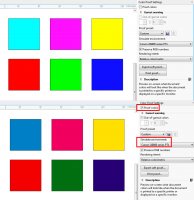
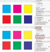
For a better understanding of what I'm trying to say, I made a simple test (please see the attached images): I created six C,M,Y,R,G,B squares in RGB space (first image) and in CMYK space (second image).On the top of the images, the squares are shown as seen on the monitor - and, of course, the RGB ones look much better.
But on the bottom, I have simulated the printer environment (I used a random Canon profile) and you can see how different the things become: the RGB colors are hugely shifted, while the CMYK colors (apart for a very slight fade) remain the same.
RGB.jpg
CMYK.jpg
 
Top