i1Studio Argyll printer ICC profiles problem

petrena

Newbie to Printing
Joined
Jul 21, 2018
Messages
14
Reaction score
2
Points
9
Printer Model
Canon IP7250
Hi,

made a few profiles with i1Studio, Argyll and the Colormunki photo.
I have 2 problems: With i1Studio colours and gradient is fine, but the prints (also in proof) come out too pale...?
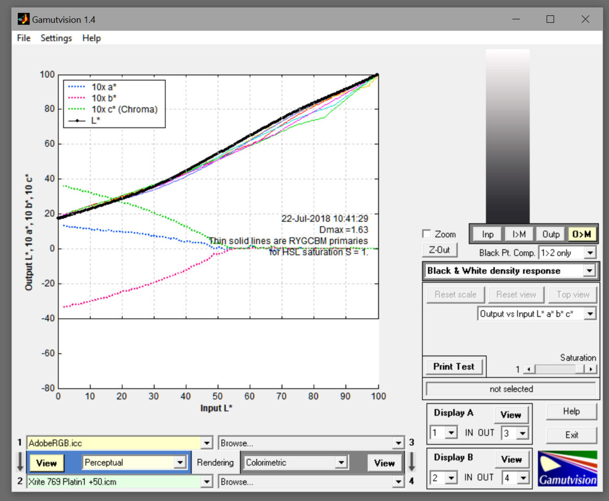
X-Rite.jpg


With Argyll black is OK, but the dark tones are cut, the curve is very strange!?
Argyll.jpg


this is a profile from an ICC Service, perfect...
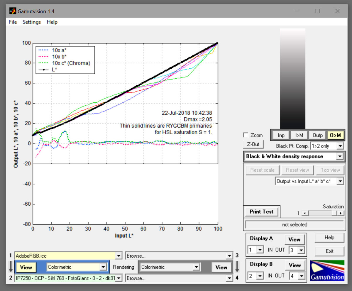
ICC Service.jpg


so confused, don't know if the colormunki or Argyll is the problem...
 

Ink stained Fingers

Printer VIP
Platinum Printer Member
Joined
Dec 27, 2014
Messages
6,102
Reaction score
7,280
Points
363
Location
Germany
Printer Model
L805, WF2010, ET8550, T3100X
I'm irritated about the graphs - the top one is set to Perceptual/Colorimetric, the other two diagrams are set to Col/Col, probably causing different black levels (from black point compensation) which differ between all three graphs, this should be sorted out. Which instruments have been used - besides different software ? How many patches have been printed for those measurements ? Is it known which equipment has been used by the ICC profiling service ? The icc properties might list this in the parameters ? It may make sense to make some manual spot readings of some color spots - the darker ones - to compare them - ColorMunki vs. I1Profiler
 

petrena

Newbie to Printing
Joined
Jul 21, 2018
Messages
14
Reaction score
2
Points
9
Printer Model
Canon IP7250
I chose preceptual with the X-Rite profile because it is recommended...
Colorimetric (is this relative?) with the other two, because this is what I always did with printing. The online-service profiles were usually very good with this intent.
Used colormunki for Argyll and X-Rite, Argyll with 210 patches with preconditioning
 

Ink stained Fingers

Printer VIP
Platinum Printer Member
Joined
Dec 27, 2014
Messages
6,102
Reaction score
7,280
Points
363
Location
Germany
Printer Model
L805, WF2010, ET8550, T3100X
I'm not getting the point why there should be a benefit to use 'perceptual' just with X-Rite profiles but rel. col. with profiles from other sources. And since we are not comparing here the color rendering of prints but profile data we should try to use the same settings. There is nothing wrong with the perc. intent, it was specifically created longer time ago by the ICC consortium for a particular range of applications. There must be an explanation for the wide variances of the black point value. How many patches have been used for the other profiles ? The fluctuations in the darker range of the Argyll profile look like reading errors for me.
 
Last edited:

petrena

Newbie to Printing
Joined
Jul 21, 2018
Messages
14
Reaction score
2
Points
9
Printer Model
Canon IP7250
What I noticed now is that enabling/disabling BPC in Photoshop in the relative intent makes no difference!?
 

Ink stained Fingers

Printer VIP
Platinum Printer Member
Joined
Dec 27, 2014
Messages
6,102
Reaction score
7,280
Points
363
Location
Germany
Printer Model
L805, WF2010, ET8550, T3100X
when comparring profiles I rather would not add any additional complexity and functions - BPC - rendering intents - but just compare the base profile data. Black point compensation is not a function of a profile but the software used for printing with an icc profile and adjusting the luminance curve in the darker range, Photoshop or other software just reads the black level and does the adjustments. I'm not using Photoshop for printing but Qimage which gives me more flexibility in this regard - I can do my own black point compensation if and as I want to .
But back to your luminance diagrams - the first question remains why they show such different black points of your paper - a black point just below 20 is poor for a photo paper and can explain your comment of a pale print - you are missing quite a lot of contrast. So what would you get if you change the setting from 'perceptual' to rel. col. in the first diagram as you use them for the other diagrams.
 
Last edited:

petrena

Newbie to Printing
Joined
Jul 21, 2018
Messages
14
Reaction score
2
Points
9
Printer Model
Canon IP7250
But back to your luminance diagrams - the first question remains why they show such different black points of your paper - a black point just below 20 is poor for a photo paper and can explain your comment of a pale print - you are missing quite a lot of contrast. So what would you get if you change the setting from 'perceptual' to rel. col. in the first diagram as you use them for the other diagrams.

The luminance diagram from the Xrite Profile with the relative intent shows a Dmax that is "correct", about 2,1. So does the diagram "without" intent, which is also linear. So I think Argyll "messes up" the luminance curve of the relative intent, with this ugly "Dog foot"...
This is why I ask If maybe the BPC could help here, fixing the curve in the dark Tones. But unfortunalely Ii does not work at all in Photoshop
 

Ink stained Fingers

Printer VIP
Platinum Printer Member
Joined
Dec 27, 2014
Messages
6,102
Reaction score
7,280
Points
363
Location
Germany
Printer Model
L805, WF2010, ET8550, T3100X
It's not the job of black point compensation (BPC) to smooth profile irregularities
http://www.gamutvision.com/docs/blackpoint.html
and we still don't know why the black points differ so much - reading errors - or different printer driver settings to print the patch sheets may need to be reviewed.
With a black point of L*= 6 or 8 you won't gain much from BPC anymore, that's already a pretty good black point value.

The nonlinearities in diagram 2 at the dark end may be reading errors - it's not clear at this time but I would not assume that ArgyllCMS would generate a profile with these kinks out of otherwise smooth data.
 

petrena

Newbie to Printing
Joined
Jul 21, 2018
Messages
14
Reaction score
2
Points
9
Printer Model
Canon IP7250
But back to your luminance diagrams - the first question remains why they show such different black points of your paper - a black point just below 20 is poor for a photo paper and can explain your comment of a pale print - you are missing quite a lot of contrast. So what would you get if you change the setting from 'perceptual' to rel. col. in the first diagram as you use them for the other diagrams.


This is the profile, made with i1Studio, with rel. col. Note: with the same printing setting Argyll reads black with Dmax about 2.3
Xriterelcol.jpg
...
 

petrena

Newbie to Printing
Joined
Jul 21, 2018
Messages
14
Reaction score
2
Points
9
Printer Model
Canon IP7250
second diagram, without intent:

Argyllnone.jpg
 
Top